
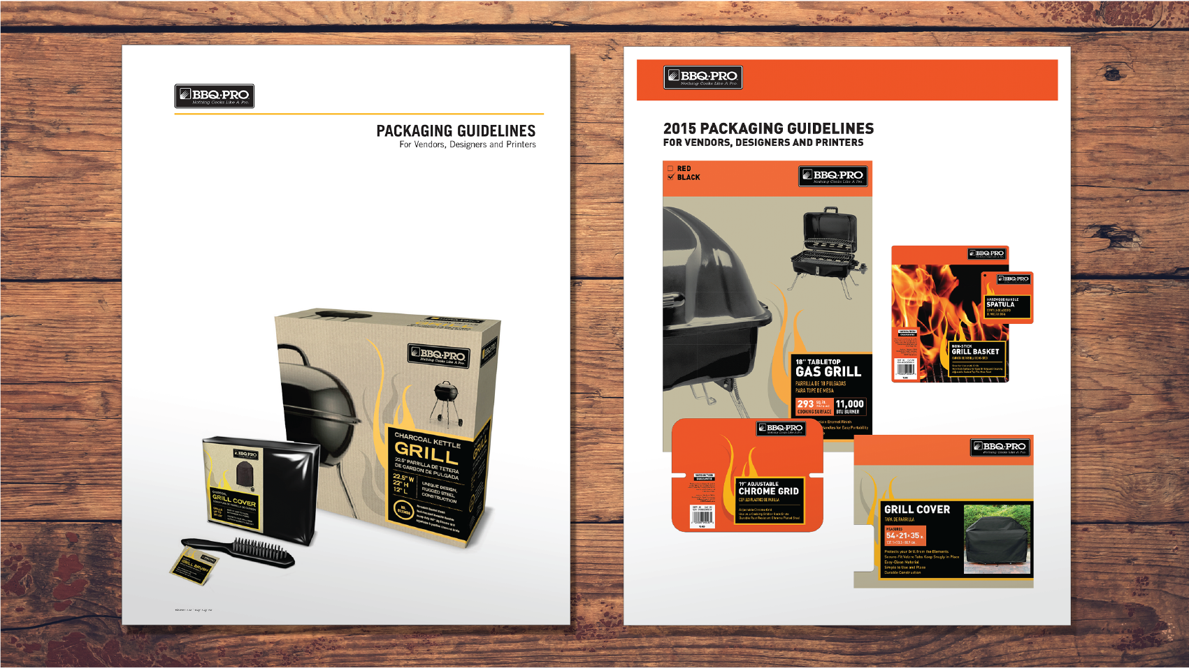
Before (left) and after (right) the refresh of the packaging guidelines. New packaging features more vivid color blocking and improved readability.
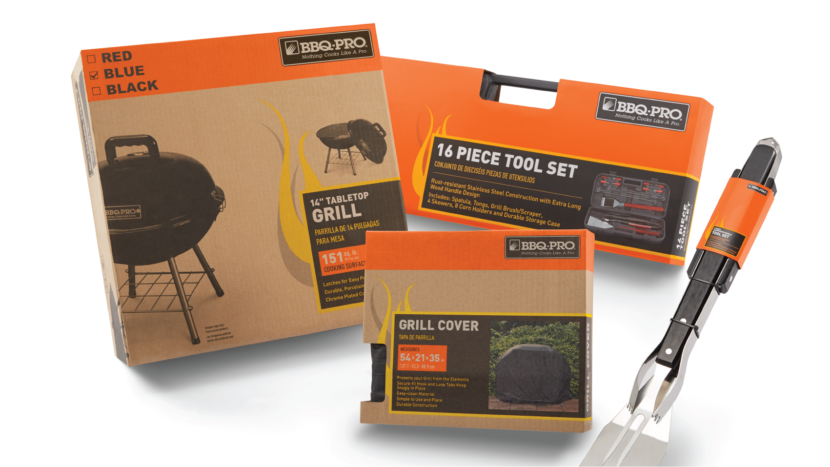
Final packaging refresh, featuring the addition of the bold orange, a reworked flame and product description. The challenge was to keep the colors consistent among both flexo printing on cardboard and offset printing on CCNB.
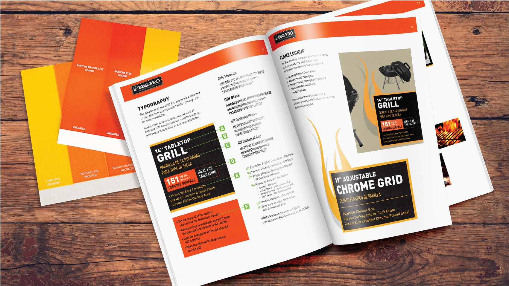
Ink drawdowns (upper left) assisted in optimizing a color palette across two substrates. Updated brand standards also included a toolbox of redesigned "flame" lockups, photography and font treatments.