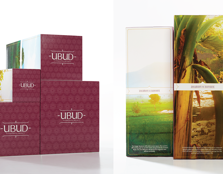


The simple, staid monogram instills confidence in this line of affordable cosmetics.
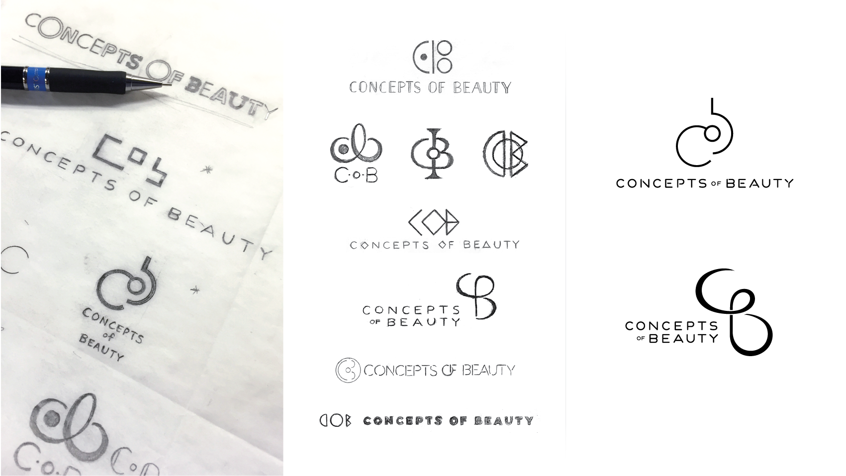
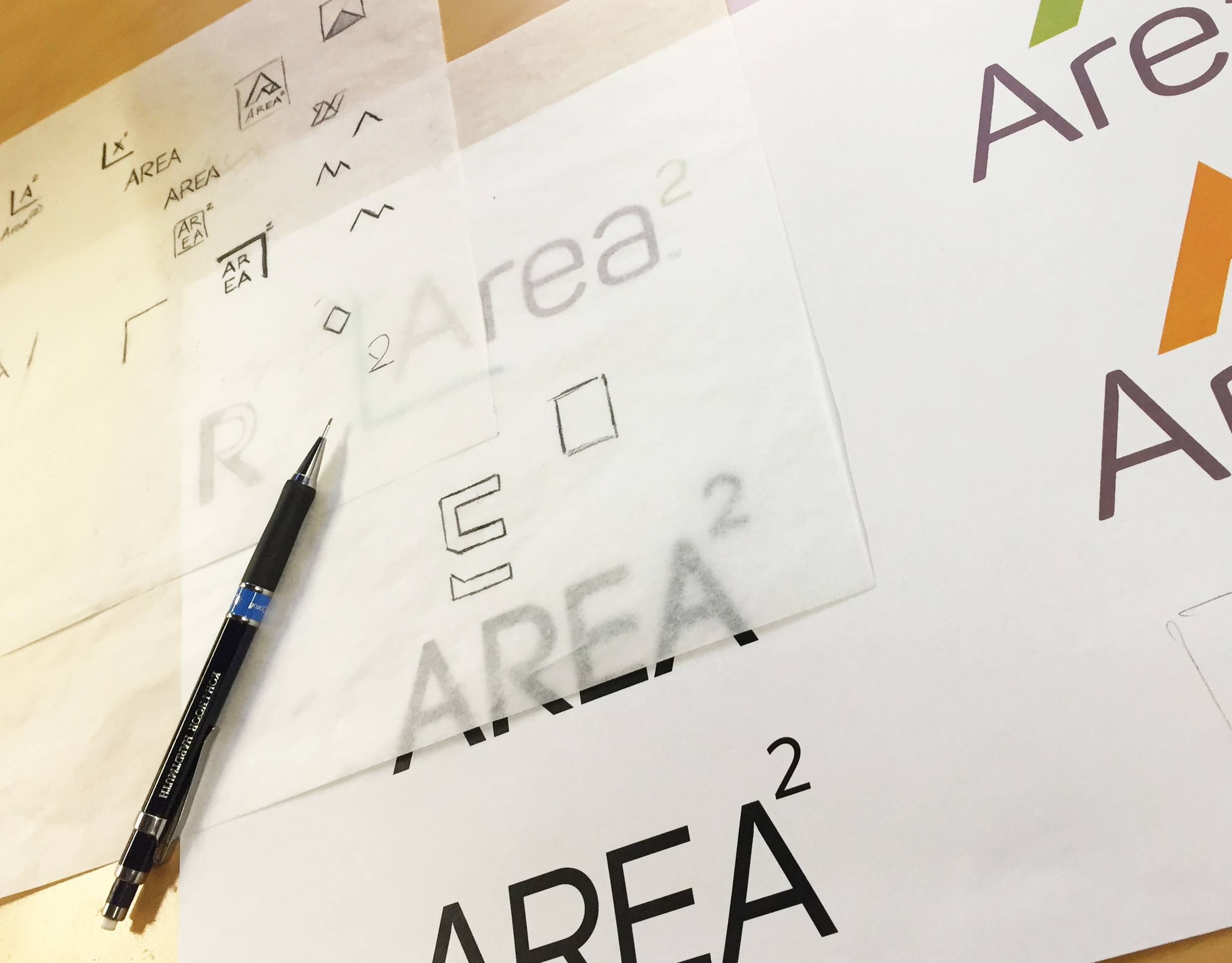
Initial sketching and exploration of the brand identity.
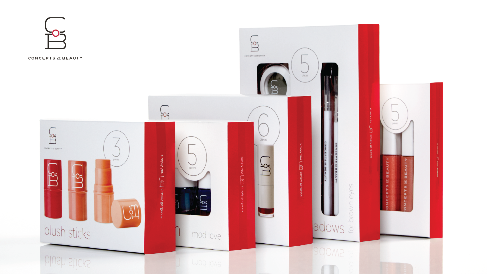
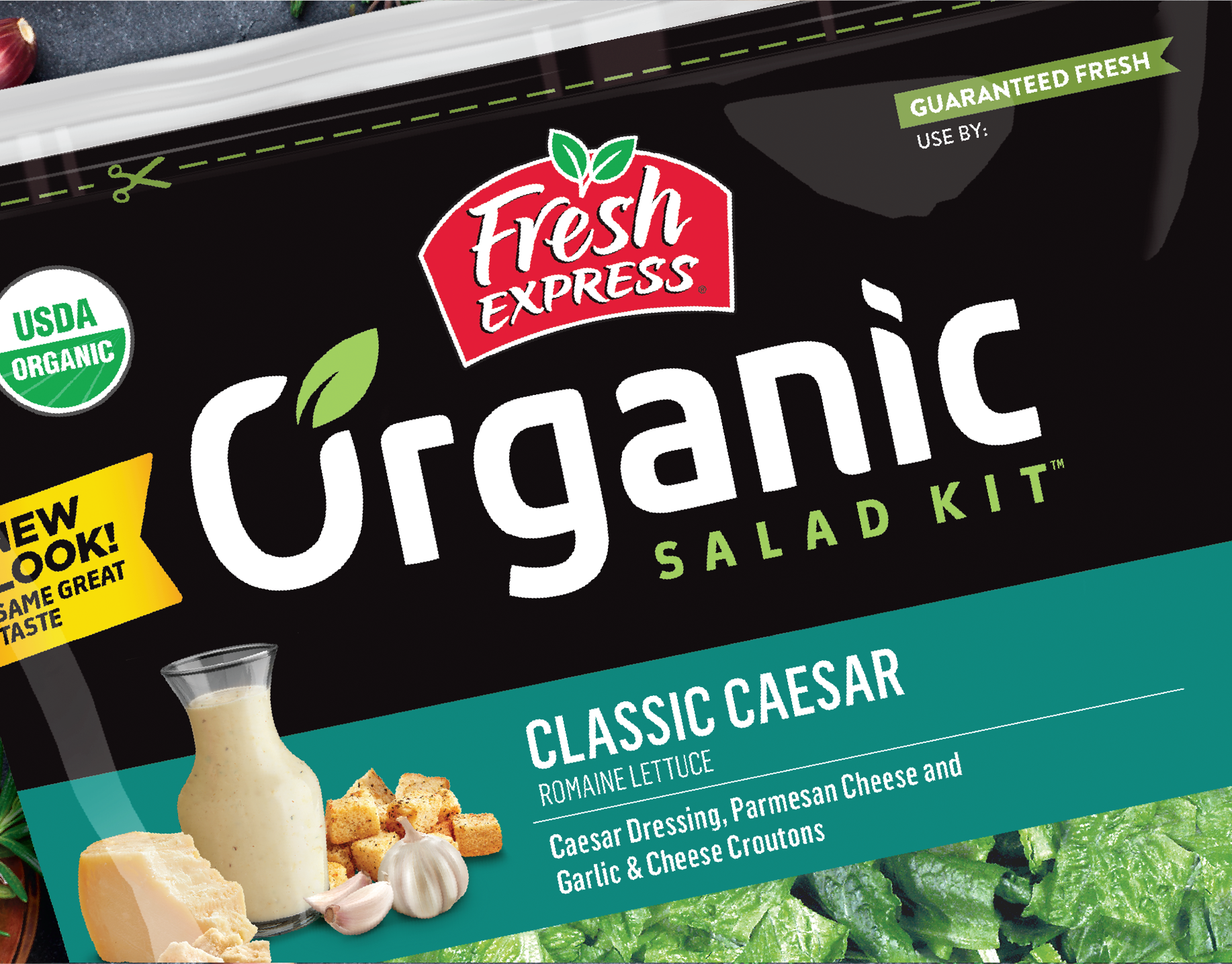
Clean, white front of pack, bold product count number, and a surprise hit of bright red on the side make an arresting statement.
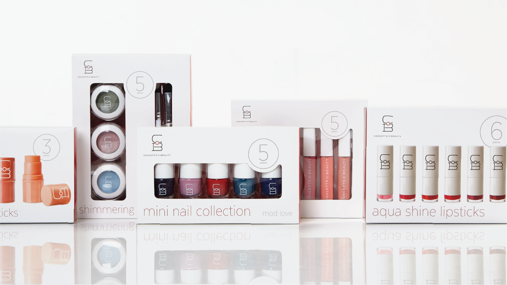
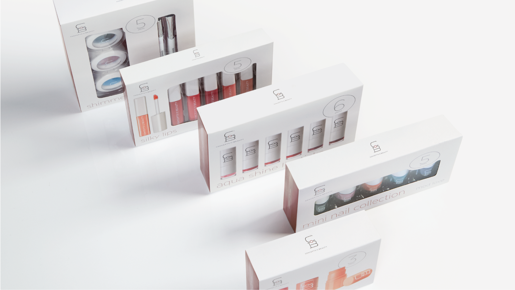
Clean, simple brand architecture keeps a solid shelf presence while allowing the product to stand out.
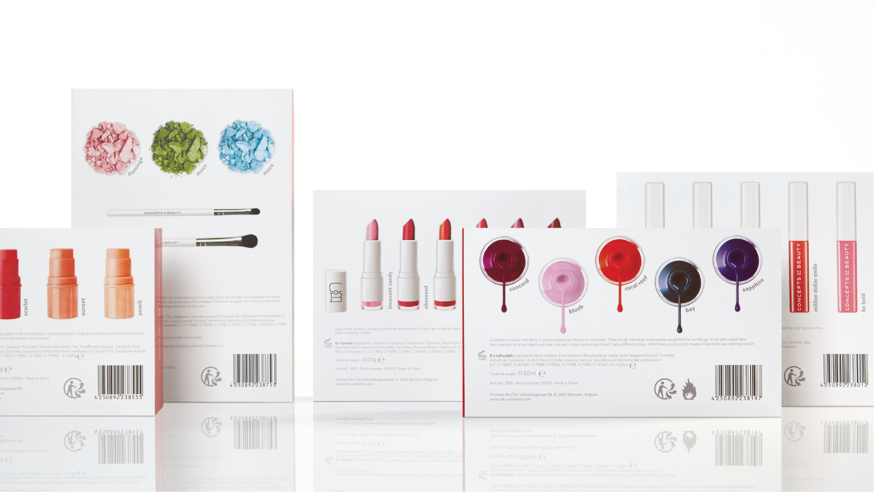
Back of pack balances vivid photography with pertinent product information.
Top of package is kept clean, allowing only the brand logo.
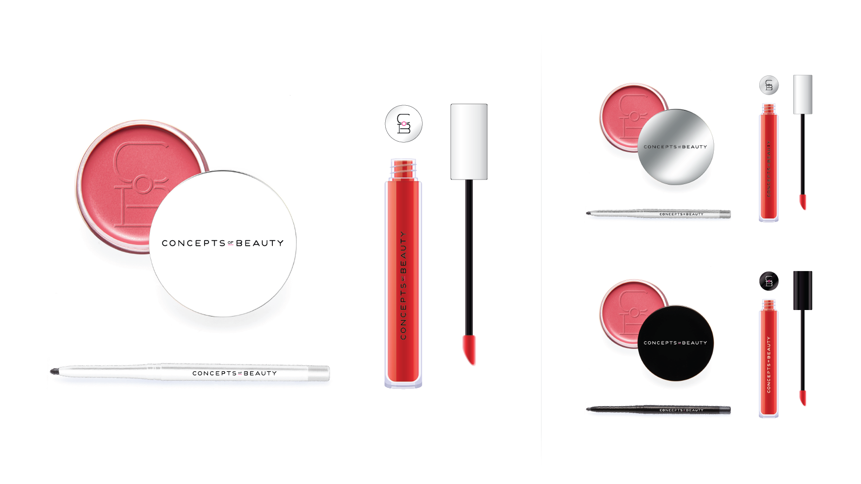
On-product branding examples.
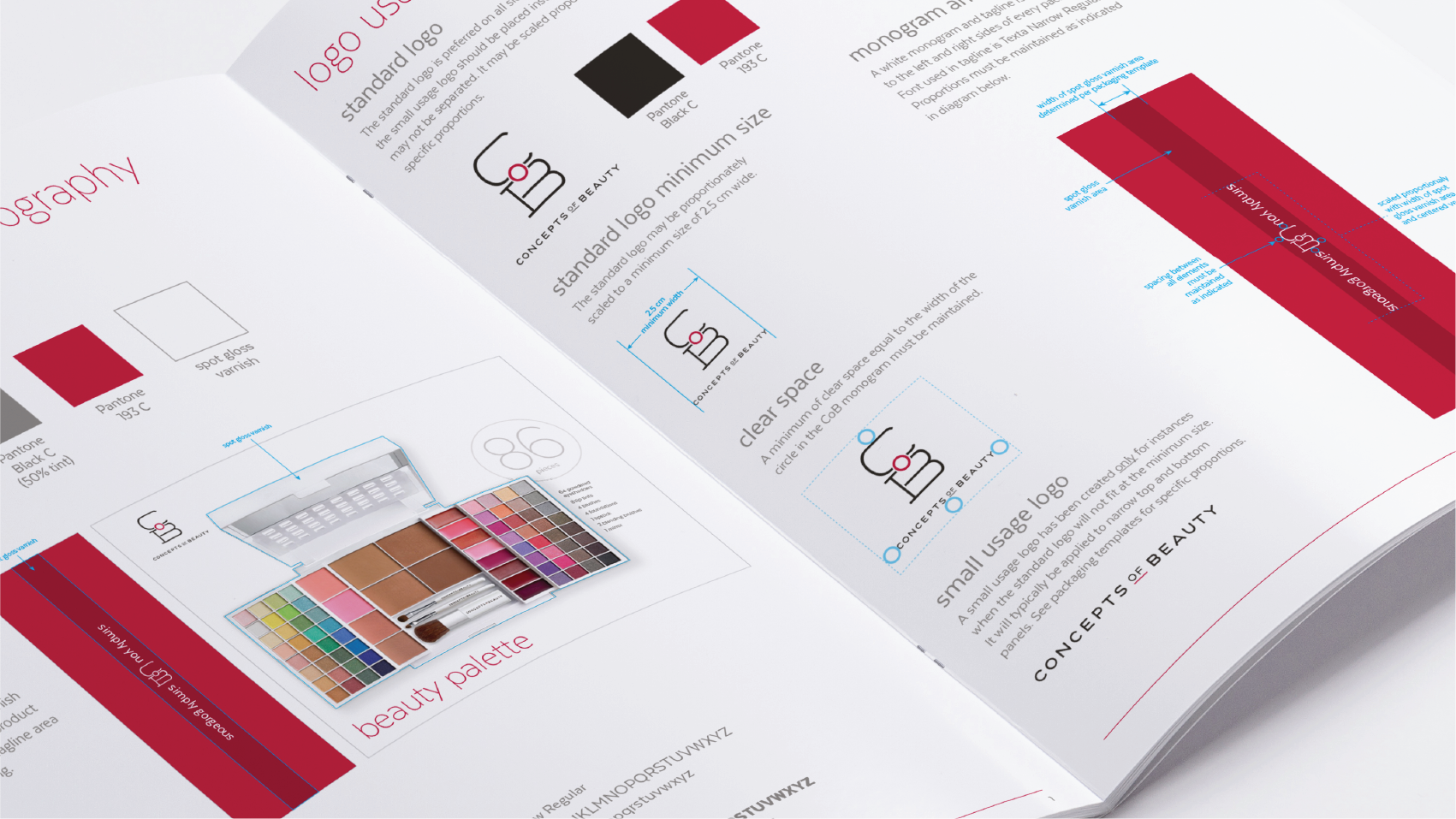
Detailed brand guidelines created to ensure consistent execution of this multi-SKU product line.
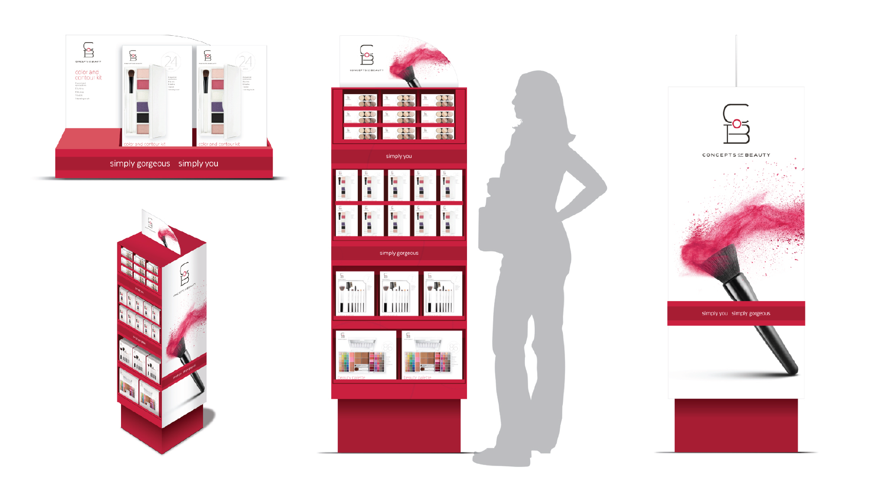
Bold, clean displays draw attention in a busy drugstore environment.